Building an interactive nutrition app...how it's going
Alrightie, update number two. So after fiddling with Cursor to create the afore-seen simple quiz, I decided to try creating something a little bit more involved–a mini interactive app-style program.
The idea
The concept is a phone-based learning app for kids that teaches nutrition through animated lessons and mini-games. I would rather like for the animated lessons to be short-form video, but for now Cursor is creating it in presentation form. Hopefully once I get the hang of this and am happy with the project, we’ll put in the work to make them into video format.
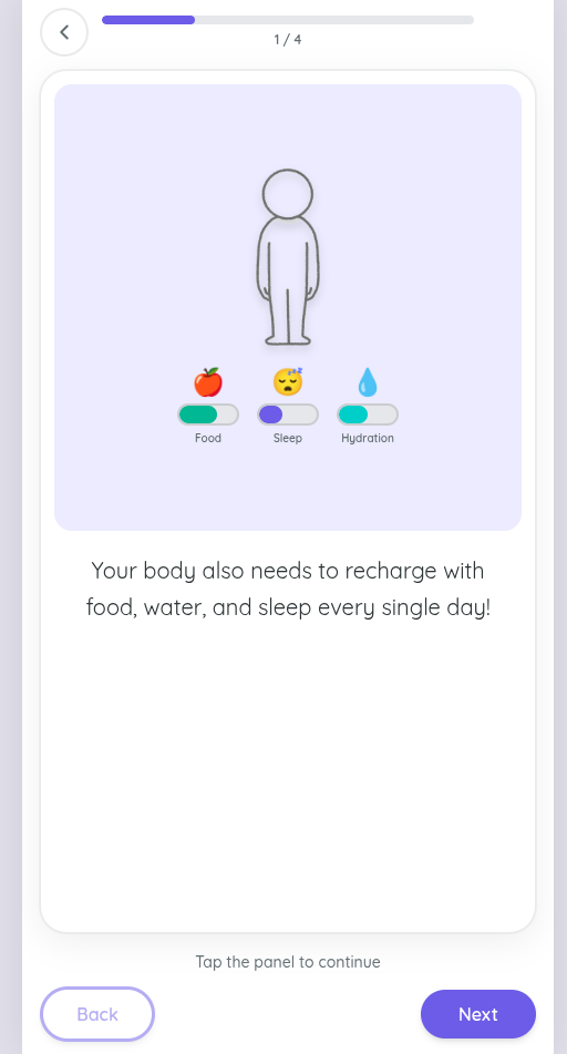
The idea for this “app” is to impart understanding of how food actually powers our body, rather than just “these foods are good for us, these foods are bad for us.” There will be no calorie counting, no “good food / bad food” shaming, just explanations as to what makes up the foods we eat, and how those foods interact with the body–specifically with our cells and subsequent body systems–to power us and enable us to function well day after day.
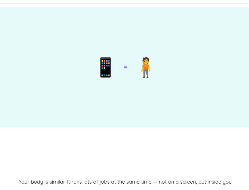
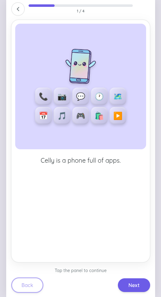
The core analogy running through this app is: the body is like a phone. Body systems are like apps. Food is the charger. If you don’t charge your phone properly, the apps don’t work so well, etc etc.
I’d like to point out that while I want the target audience to be around 10-12y olds, what actually got churned out is a bit simpler and I think targets more 7-8 year olds. This is something I aim to correct moving forward.
What got built
The app is built with React, TypeScript, and Tailwind CSS, with Framer Motion handling the animations. No backend — everything runs locally in the browser.
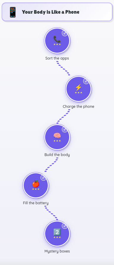
Here’s what exists so far (all of Module 1: “Your Body is Like a Phone”):
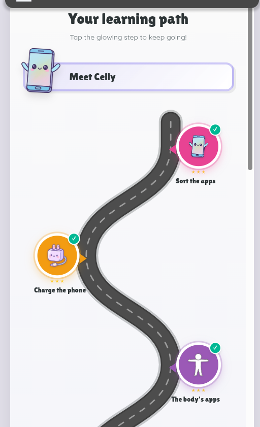
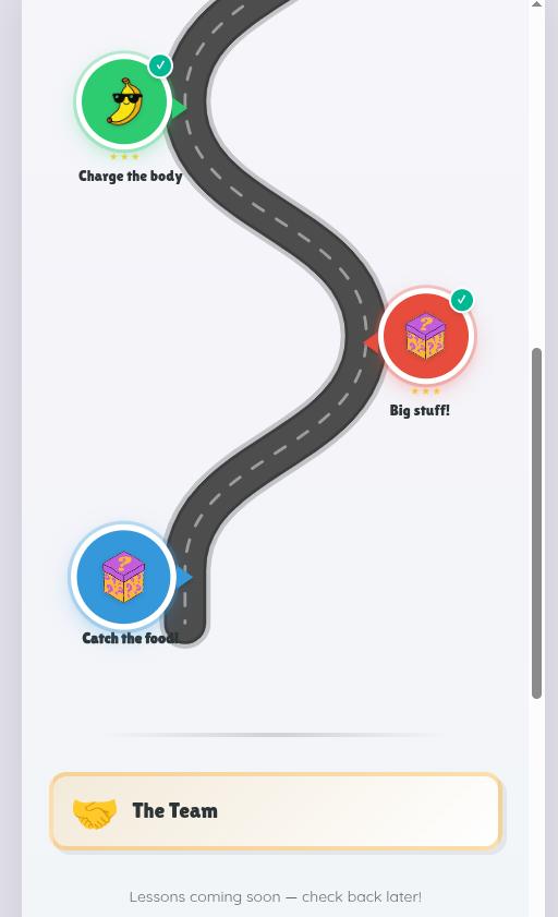
- A learning path — a winding road with checkpoint nodes, kind of like a board game trail. Completed nodes light up, the current one pulses, and future ones stay locked.
- Animated lesson panels — short comic-strip-style sequences where you tap through to learn. Each panel has an illustration and a sentence or two of text.
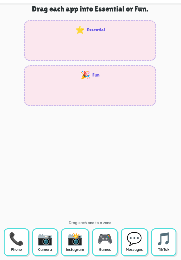
- Six different game types that slot in after each lesson:
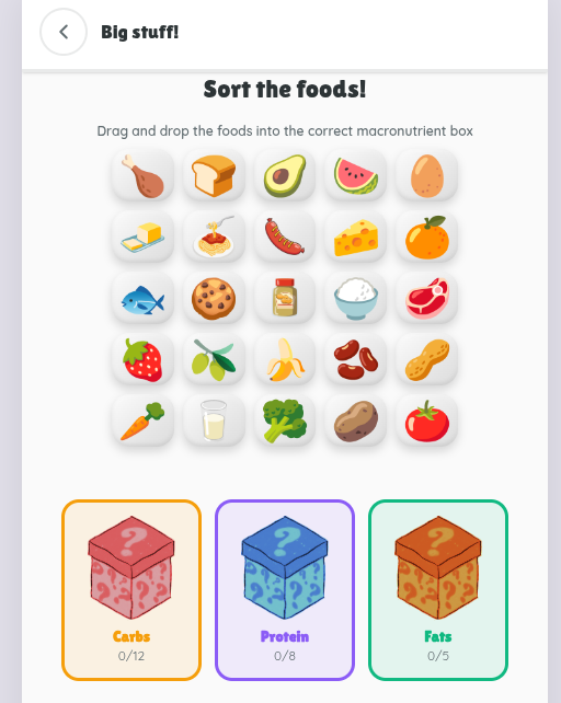
- Drag and drop — sorting food into macronutrient boxes, dragging organs onto a body outline, organizing apps on a phone
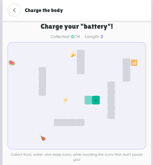
- Snake games — one where you guide a plug to a phone, collecting lightning bolts along the way; another where you grow a snake by eating food, water, and sleep icons while avoiding bad ones
- A catcher game — falling foods that you catch in the right category box.–This one is non-functioning, as I intend to use the concept for a later topic and will fix the game functions then.
Each game gives you 1–3 stars and a fun fact at the end.
The revision process
This is where it gets interesting. Building it was one thing. Getting it to look and feel the way I actually wanted was rather tedious and sometimes frustrating.
A few things I went back and forth on:
The art style. Initially the style was emoji-based characters for everything. It looked generic, basic, and well, ugly. I showed my kids and they let me know it looked boring. I had initially created a Canva presentation of this project using the graphics, colors, text and style that I envisioned. So I fed those pages as pngs to Cursor asking it to gain context from my designs, but something got lost in translation. Cursor then spat out the exact same application but with my slides as the images instead. It looked worse. I changed tactics. I had Cursor remove single graphics from my Canva presentation and save them out. Then I went through the app slide by slide and instructed Cursor when to replace current images with specifics images from Canva. That worked. It started looking more like I wanted. Even my daughter gave her approval. Whew.
The learning path. The first version was a plain vertical list of nodes. It worked, but it was boring. I redesigned it as a winding road with location-marker checkpoints–more visually engaging, gives that “journey” feeling, and slightly less “duolingo” looking. Here’s the original output:
Game prompts and instructions. I kept tweaking the wording on each slide screen and made numerous small changes to all the games. Some games I changed completely–e.g., removing a multiple choice question game to a snake game.
What I’m learning
Correctly using Cursor. I made several errors in this. Instead of creating a new folder for my blog creation, I opened a new chat within the app folder for this purpose. This lead to a fantastic mix up of prompting the blog chat to fix game components in the app. Meh. Additionally, I learned the need to pause after a period of vibe coding, to reflect on all the changes I had requested and identify what was core to the app development. Those core features like, never include text below an image icon, should then be added to the agents.md file or the app-plan.md file so that it carries over across all future work.
Drafting versus refining. The biggest takeaway so far is that building the thing is maybe 40% of the work. The other 60% is refining–adjusting text, rethinking layouts, swapping out visuals, and iterating until it actually matches what’s in my head. Cursor has been a useful partner in that process, but I still have to know what I want and be willing to push back when the output isn’t quite right. This process is also showing me where my gaps are–where I lack clarity both in what I want my project to be or in how I relay my ideas to the Agent.
How it’s looking
The learning path. After many tweaks and adjustments, here’s the final look of the learning path.
Main slides. The main slides look a bit like this.
Game features. Here are two game features–still simple but a little more visually appealing.
What’s next
Module 1 is in decent shape. Next up is Module 2: “The Team”–where we’ll go a bit more indepth into the macronutrients, specifically the molecules (glucose, amino acids, and fatty acids) that comprise each one, and how to determine which food falls under which macronutrients. So yeah, new lesson content, new game configs, and probably more art iterations.
Until next time.